BLOGGER TEMPLATES AND TWITTER BACKGROUNDS »

Final Music Video

Final Digi-Pack

Final Advertisement

Evaluation - Question 1,3 and 4

Evaluation - question 2

2) How effective is the combination of your main product and ancillary tasks?
When I first had to create my ancillary tasks, I wanted to ensure that I had a consistent theme running throughout them so that my target audience of teenage girls would have appeal to them and that they related to my music video well. For the inspiration of my Digi-pack and magazine advert I looked at Pixie Lott who was the artist of my chosen song for my music video, "like a broken arrow". We wanted to portray Pixie Lott as a young teenage girl who is trying to connect with her audience. So, I decided to use locations that teenagers would be familiar with such as parks, benches and their front living room.
For my Digi-pack I used the black and white theme that I have running throughout music video which gave it the professional look that I wanted to and I think it fitted with the lyrics/theme to the song (relationship break ups). For the front cover I took a print screen from my actual music video where Elle is resting against a white wall. I used this image as the audience will be familiar with it from the music video and it will clearly show that she is the main female protagonist being re
presented in the video. I adjusted the contrast a little more so that she stood out against the all and adding in a "swirly" font which i downloaded from a fonts website as I think this fitted with my pop genre and showed the young and girly character, inspired by Pixie Lott herself.
For the inside covers I chose a "kiss" shape to represent the love within the music video and on the other I used a black silouette of the cupid with an arrow as I also had this in my music video as an overlapping shot of when Elle and Alex in the video are arguing, the arrow breaks over them.
Here is my second ancillary task which is my magazine advert. Again, I have kept the consistency running throughout by continuing the black and white theme and again using a "swirly/girly" font to keep the initial idea of portraying Pixie Lott as much as possible. Again I have used screen shots from my music video so the audience can relate to the advertisement as they recognise them fro the video itself. The purpose of this was to promote the album itself. I used quotes from famous music magazines to make it look more professional and believable.
Overall, I think the overall effectiveness of the combination of my ancillary tasks is good because I have used the same locations, fonts and images throughout that my target audience of teenage girls will be able to relate to and along with the storyline and narrative of the music video.

Evaluation - Voice over

Sunday, 26 September 2010

mood board


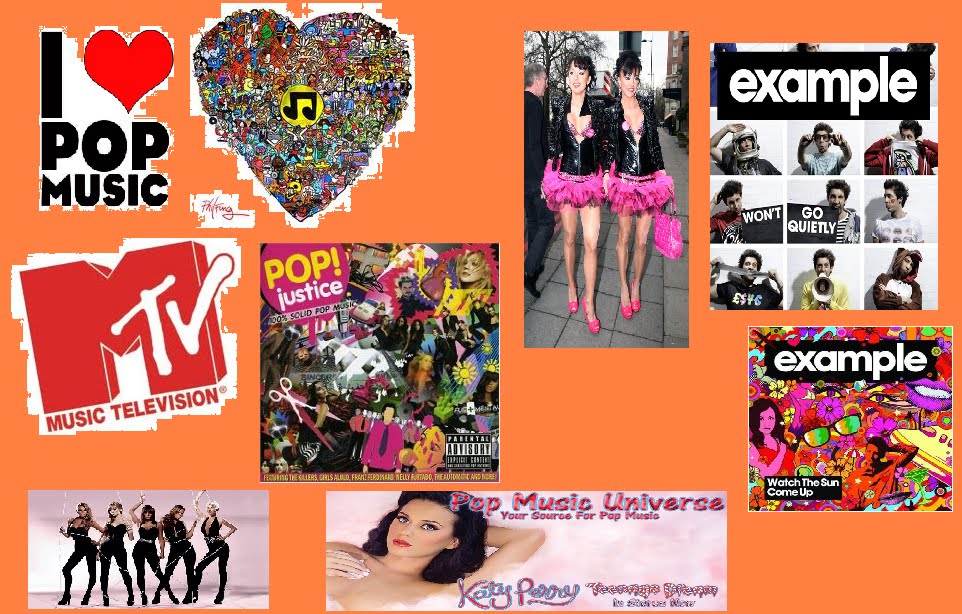
As you can see from this mood board i made, the genre that we as a group have chosen to research is electro pop. Electro giving pop the slightly more modern twist then pop was before such as "the cheeky girls" and pop, simply because of what it stands for today "popular music".
The images in my mood board are taken from the search engines "Google" and "yahoo", both popular in the media today. I chose to put orange as the background as it is a bold, bright colour which represents our genre "electro pop" very well. The "MTV" logo represents just one of the popular music channels in which electro pop music is played on a daily basis including artists such as Katy B, Katy Perry, Example and so on.
there are also various images of a few artists who are either pop, electro, or electro pop as one combined genre. These include Katy Perry, The Cheeky Girls, Girl Aloud and Example. The 3 in which i would like to focus on in further detail are Katy B, Katy Perry and Example.

0 comments: